Hawkish Capital
Brand identity refinement and visual direction for Hawkish Capital — a modern investment firm positioned with clarity, precision, and institutional confidence.
Hawkish Capital required a refined brand identity that could better reflect its positioning within modern finance and investment markets.
The direction needed to feel sharp, credible, and institutional while maintaining a distinctive visual presence that separates the brand from traditional financial firms.
Our role focused on evolving the existing identity system through logo refinement and a broader visual language designed to communicate clarity, precision, and long-term confidence.
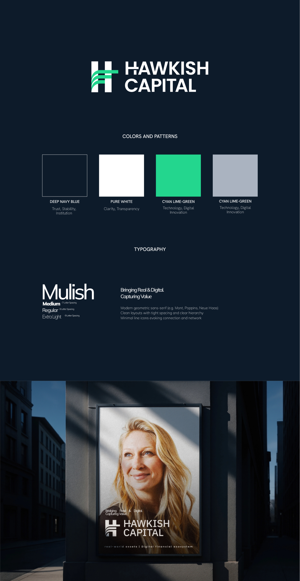
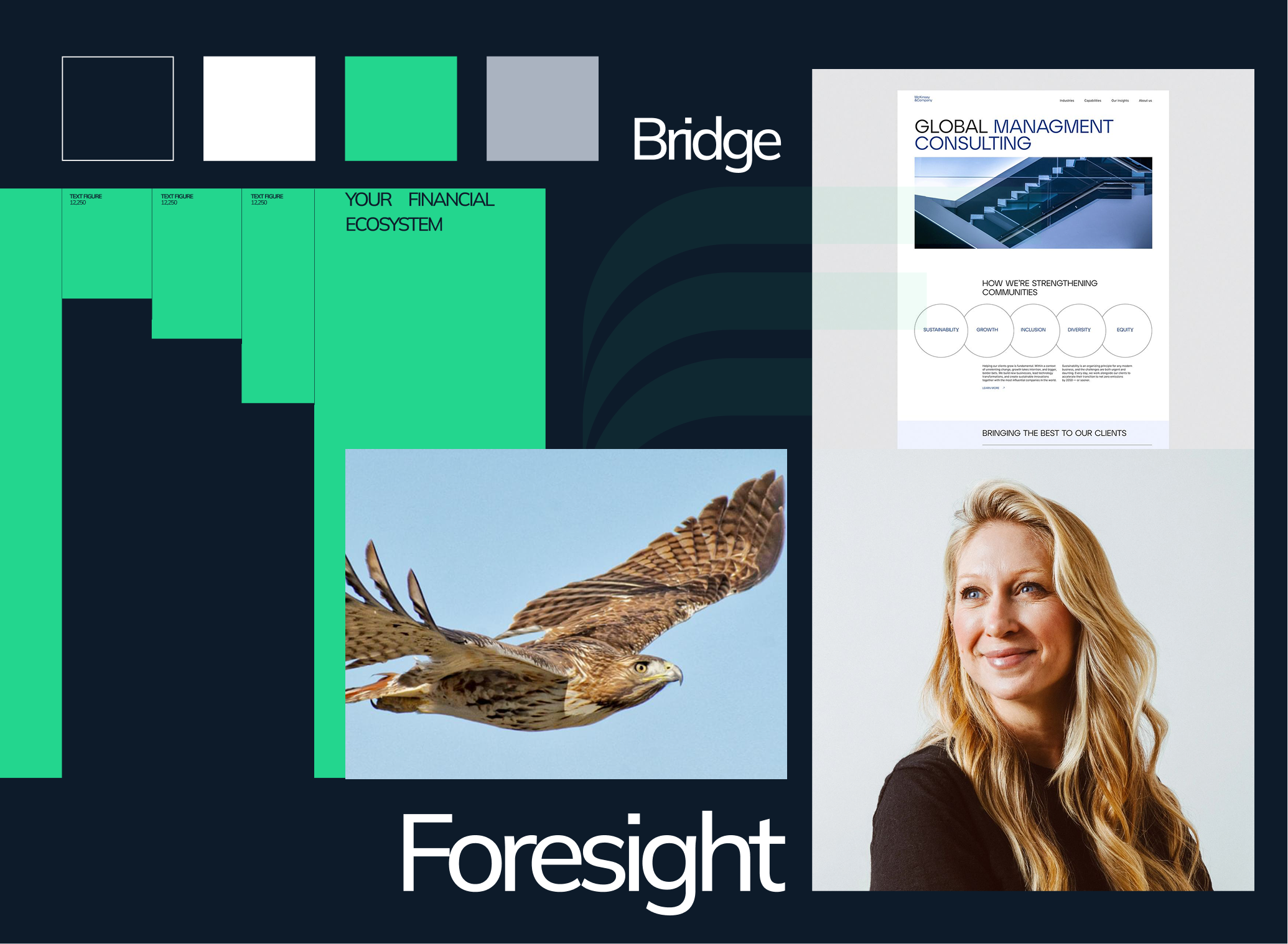
We refined the Hawkish Capital logo to create a cleaner and more balanced identity system that feels stronger across both digital and physical applications.
Building on this foundation, we developed a cohesive visual direction centred around structure, contrast, and controlled simplicity — allowing the brand to feel contemporary while retaining institutional credibility.
Typography, spacing, composition, and supporting brand elements were designed to create consistency across presentations, digital platforms, and investor-facing materials.
Hawkish Capital established a more refined and recognisable visual presence across its brand ecosystem.
The updated identity strengthened brand consistency, improved perception across stakeholder touchpoints, and created a more scalable foundation for future growth and communication.